
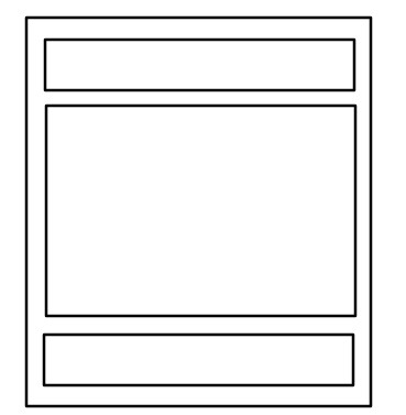
1.单列布局
最简单的布局,默认三个部分是等宽的,“通栏”指的是中间部分比较窄。
等宽单列布局
代码示例:
<body>
    <div class="header"></div>
	<div class="content"></div>
	<div class="footer"></div>
</body>
.header,.content,.footer {
width:960px;
margin:0 auto;
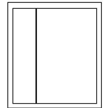
}通栏单列布局

代码示例:
.header,.footer {
    width:960px;
    margin:0 auto;
}
.content {
    width:800px;
    margin:0 auto;
}
2.两列布局
一列定宽或者宽度由内容撑开,另一列自适应,撑满剩余宽度。
float + BFC
左边部分设置左浮动,右边部分通过 overflow:hidden 开启 BFC,为了规避浮动对自己的影响(不让自己被浮动的元素覆盖),它会往右边移动直至不被浮动元素覆盖。
代码示例:
<div class="left"></div>
<div class="right"></div>
.left {
float: left;
}
.right {
overflow: hidden;
}float + margin-left
左边部分设置左浮动,右边部分通过 margin-left 进行移动,使自己不被浮动元素覆盖。这种方式要求左边部分必须是定宽的,因为 margin-left 的取值依赖于左边部分的宽度。
.left {
  width: 100px
  float: left;
}
.right {
  margin-left: 100px;
}
利用 flex 布局
设置父盒子为弹性盒,则左右两部分默认水平排列。左边部分默认通过内容撑开宽度,右边部分通过 flex:1 利用剩余宽度。
代码示例:
.parent {
  display:flex;
}
.right {
  flex:1;
}
利用 grid 布局
代码示例:
.parent {
  display:grid;
  grid-template-columns:auto 1fr;
  grid-gap:20px
}
3.三列布局
指的是左右两列固定宽度,中间列自适应。

圣杯布局
代码示例:
<article class="container">
    <div class="center"></div>
    <div class="left"></div>
    <div class="right"></div>
</article>.body{
min-width: 600px;
}
.container {
padding-left: 220px;
padding-right: 220px;
}
.left {
float: left;
width: 200px;
height: 400px;
background: red;
margin-left: -100%;
position: relative;
left: -220px;
}
.center {
float: left;
width: 100%;
height: 500px;
background: yellow;
}
.right {
float: left;
width: 200px;
height: 400px;
background: blue;
margin-left: -200px;
position: relative;
right: -220px;
}实现步骤:
- 首先我们想要优先加载 center 部分的内容,所以 dom 结构上先写 center
- 为了让三者共在一行,给它们设置浮动;为了让 center 自适应,给它设置宽度 100%。此时布局是这样的:

这里要注意的点:块级元素在不显式设置宽度的情况下确实撑满整个屏幕,从这个角度来看,width 设置为 100% 似乎没有必要。但不要忘记了我们给它设置了浮动 —— 浮动元素具有包裹性,在不显式设置宽度的情况下由内容撑开。这里如果不设置 100% 宽度,且里面没有足够的内容,那么会导致布局崩坏。
- 设置 left 和 right 的 margin-left 为负值,让它们回到与 center 同一行。此时布局是这样的:

这里要注意的点:所有浮动元素可以看作位于同一个浮动流,利用负边距可以让某个元素在这个流中移动,并且会叠加到相应元素的上面。对于 left 来说,它需要左移父元素的总宽度,对于 right 来说,它需要左移自身宽度。
- 设置父容器的左右 padding,使内部内容向中间挤压,从而使左右留白。此时布局是这样的:

- 给 left 和 right 设置绝对定位,让它们占据父元素的留白空间。最终得到的布局是这样的:
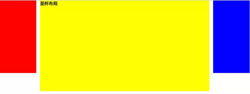
- 给页面设置
min-width: 600px
这里要注意的点:由于左右两列宽度固定,因此我们至少要给页面一个最小宽度,但这个最小宽度并不是简单的左右两列宽度之和 —— 别忘了,之前的 left 位于 center,left 是 relative 定位,所以在 center 上占据过的空间不会消失。所以页面最小宽度是 left-width * 2 + right-width。
缺点;
如果其中一列内容高度拉长,其他两列的背景并不会自动填充(后面介绍的等高布局可以解决这个问题)
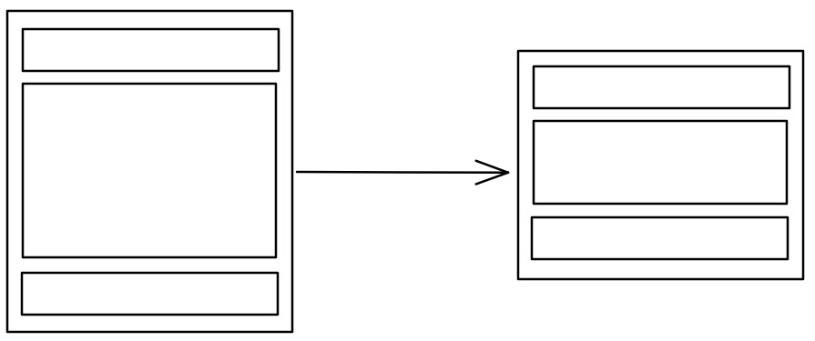
双飞翼布局
双飞翼布局在圣杯布局基础上进一步优化,解决了圣杯布局错乱问题,实现了内容与布局的分离。而且任何一栏都可以是最高栏,不会出问题。
代码示例
<div class="center">
    <div class="inner">双飞翼布局</div>
</div>
<div class="left"></div>
<div class="right"></div>
.body {
min-width: 600px;
}
.left {
float: left;
width: 200px;
height: 400px;
background: red;
margin-left: -100%;
}
.center {
float: left;
width: 100%;
height: 500px;
background: yellow;
}
.center .inner {
margin: 0 200px; /* 主要区别 */
}
.right {
float: left;
width: 200px;
height: 400px;
background: blue;
margin-left: -200px;
}3.2.2 实现步骤
前两步与圣杯布局一样:
- 三个部分都设定为左浮动,然后设置 center 的宽度为 100%,此时,left 和 right 部分会跳到下一行;
- 通过设置负 margin 让 left 和 right 部分回到与 center 部分同一行;
这里开始有所不同:
- center 部分增加一个内层div,并设margin: 0 200px;
- 同样要给页面设置最小宽度,这里没有用定位,所以最小宽度可以直接等于左右两列宽度之和
3.2.3 缺点:
多加一层 dom 树节点,增加渲染树生成的计算量。
两种布局的对比:
- 优先加载主列。
- 三列浮动,配合负外边距形成三列布局
- 两种布局方式的主要区别在于如何处理主列,从而让其内容不被覆盖。对于圣杯布局,它是利用父盒子的左右 padding 确保将主列内容挤到中间,在效果上表现为三个独立列;对于双飞翼布局,它是在主列里放置一个子盒子,利用子盒子的左右 margin 确保内容位于中间,在效果上表现为左右两列在主列上面。
利用 flex 布局
flex 布局是最简便的,而且在移动端应用广泛。
3.3.1 代码示例:
<div class="container">
    <div class="center"></div>
    <div class="left"></div>
    <div class="right"></div>
</div>.container{
display: flex;
}
.center{
height:500px;
background-color: blue;
flex: 1;
}
.left{
height: 200px;
background-color:gray;
order: -1;
flex:0 1 100px;
}
.right{
height: 200px;
background-color: red;
flex: 0 1 100px;
}3.3.2 实现步骤:
只说几个注意的点
在不优先加载主列的情况下,dom 结构可以按照左中右顺序书写,这样不需要额外设置 order;因为我们这里要优先加载主列,所以 dom 结构还是先写主列,之后通过降低左列的 order 恢复顺序。
flex 只有一个值时,设置的是
flex-grow,代表弹性子元素对父元素剩余空间的分配,因为不设置的时候默认是 0,所以这里只有设置了 1 的主列参与分配剩余空间,从而实现宽度自适应。flex 有三个值时,设置的是
flex-grow,flex-shrink,flex-basis。这里左右两列的flex-basis都是 100px,实际上为它们设置了固定宽度。
4. 三行布局
指的是头尾固定高度,不管父盒子高度怎么变化,中间部分都会自适应占满剩余高度。
calc()
body {
    height: 100vh;
}
.header,.footer {
    height: 100px;
}
.content {
    height: calc(100% - 200px);
}
利用 flex 布局
body {
    display: flex;
    height: 100vh;
}
.header,.footer {
    height: 100px;
}
.content {
    flex:1;
}
绝对定位 + padding
body {
    height: 100vh;
    position: relative;
}
.header,.footer {
    position: absolute;
    width: 100%;
    height: 100px;
}
.header {
    top:0;
}
.footer {
    bottom: 0;
}
.content {
    height: 100%;
    padding: 100px 0;
    box-sizing: border-box;
}
5.等高布局
等高布局是指多个子元素在父元素中高度相等的布局方式。
正 padding + 负 margin
该方法可以解决圣杯布局各子元素高度不等的缺点。给各个子元素设置一个大数值的 padding-bottom,再设置相同数值的负的 margin-bottom,并给总的父盒子设置 overflow:hidden,把溢出背景切掉。假设某一列高度最大,则父盒子的高度会等于这一列高度,而其他列本来的留白部分由带背景色的 padding 补偿。
基本代码与圣杯布局一样,新增代码如下:
/* 注意是三个都设置 */
.center,
.left,
.right {
    padding-bottom: 10000px;
    margin-bottom: -10000px;
}
.container {
    padding-left: 220px;
    padding-right: 220px;
    overflow: hidden;
}
关于原理,我暂时是这么理解的,不一定正确:可以看作 margin 负值是向内收缩至与 padding 高度相等处,虽然 padding 还在(所以有背景颜色),但是丧失了在空间上撑开父盒子的能力(因为此时被 margin 取代,margin 撑不开高度),即父盒子由最高列撑开,其他两列不足高度的部分由 padding 填充。
利用背景图片
这种方法是我们实现等高列最早使用的一种方法,就是使用背景图片,在列的父元素上使用这个背景图进行Y轴的铺放,从而实现一种等高列的假象。实现方法简单,兼容性强,不需要太多的css样式就可以轻松实现,但此方法不适合流体布局等高列的布局。
在制作样式之前需要一张类似下面的背景图:

代码示例:
<div class=”container clearfix”>
    <div class=”left”></div>
    <div  class=”content”></div>
    <div class=”right”></div>
</div>
.container {
background: url("column.png") repeat-y;
width: 960px;
margin: 0 auto;
}
.left {
float: left;
width: 220px;
}
.content {
float: left;
width: 480px;
}
.right {
float: left;
width: 220px;
}利用边框和定位
这种方法是使用边框和绝对定位来实现一个假的高度相等列的效果。结构简单,兼容各浏览器,容易掌握。假设你需要实现一个两列等高布局,侧栏高度要和主内容高度相等。
代码示例:
<div id="wrapper">
    <div id="mainContent">...</div>
    <div id="sidebar">...</div>
</div>
#wrapper {
width: 960px;
margin: 0 auto;
}
#mainContent {
border-right: 220px solid #dfdfdf;
position: absolute;
width: 740px;
height: 800px;
background: green;
}
#sidebar {
background: #dfdfdf;
margin-left: 740px;
position: absolute;
height: 800px;
width: 220px;
}利用 flex 布局
最简单的方法就是直接设置父盒子为弹性盒。此时弹性子元素的 align-items 属性默认值是 stretch,也就是在 y 轴上将所有子元素拉伸为同一高度,从而达到等高布局。
6.粘连布局
- 内容区
main高度足够长的时候,footer紧跟在main后面; - 内容区
main高度不够长的时候,footer粘连在屏幕的底部

代码示例:
<div id="wrap">
    <div class="main">
        main <br>
        main <br>
        main <br>
    </div>
</div>
<div id="footer">footer</div>
* {
margin: 0;
padding: 0;
}
html,
body {
height: 100%;/* 高度一层层继承下来 */
}
#wrap {
min-height: 100%;
background: pink;
text-align: center;
overflow: hidden;
}
#wrap .main {
padding-bottom: 50px;
}
#footer {
height: 50px;
line-height: 50px;
background: deeppink;
text-align: center;
margin-top: -50px;
}实现步骤
footer必须是一个独立的结构,与wrap没有任何嵌套关系wrap区域的高度通过设置min-height,变为视口高度(这是实现的关键)footer要使用margin为负来确定自己的位置- 在
main区域需要设置padding-bottom。这也是为了防止负margin导致footer覆盖任何实际内容。
参考:
https://juejin.im/post/5bbcd7ff5188255c80668028#heading-19